Fewer Words, More Narrative - Visual Storytelling in WASTE EATER
An average play-through of WASTE EATER is about 950 words long. For a narrative-focused game, that’s basically nothing. I knew going in that while writing would be an important part of the game, words couldn’t be the key focus — I wanted the waster to feel like a real person, and real people don’t usually deliver entire monologues before dying (sorry Star Wars). If I was a better writer, there’d probably be no words in the game at all.
Instead I tried to push narrative into the art and atmosphere of the game, so that all the things that would have been awkward to say could be directly seen by the player instead. And since no one’s told me that the game sucks yet, I figured I could do a write-up of some of my art decisions. None of it is particularly ground-breaking as far as the world of visual storytelling goes, but hey, this is my first game so it was new to me.
This contains spoilers for the game, so if you wanted to play it, do that first!
Choosing the right color palette
The first thing I made for the game was a little doodle sheet:

Unlike most concept art, the point of this wasn’t to do world-building or to figure out an art style. Instead my primary goal here was to put together a set of colors that felt genuinely joyful to draw in. If I could have fun doing something as simple as making lines and shapes, then the future work of drawing backgrounds and animations would be much less grueling - and much more pleasant for players to look at during long periods of silence.
Other than just being pleasant to look at, the colors had to support the game’s mood. Overall, I needed the palette to feel:
Hot: the world was ravaged by climate change and is still on the road to recovery. Choosing a bright orange as the primary color allows the story to convey heat without forcing our waster to say anything lame like “wow, it sure is hot today”.
Dark: Even though the waster is talking about some pretty grim stuff, I didn’t want their actual dialogue to be too melodramatic. There’s only so much of a pity party that you can throw for yourself in front of a bird before the whole thing starts to look silly. So instead, I leaned into dark colors. This is what the game looks like with 0 saturation:

One of the weirdest things about color that many new artists don’t realize is that saturated colors are also darker colors. While the orange might look bright, it’s actually quite low on the value scale.
Hopeful: While the waster’s story itself is pretty grim, the world still had to convey a sense of hope. A simple way to make a palette feel more optimistic is to push the saturation. That’s why children’s books don’t look like this:

By pushing the orange and dark green in WASTE EATER to almost the maximum saturation, the world literally feels more colorful. This would have been a very different game:

Is it cool that saturation, the same thing that makes your color palette feel darker, can also make it feel more hopeful? I think so. But maybe I’m just a wanker.
Color signifiers
One of the biggest problems I faced was figuring out how to make sure the player knows that it’s raining acid at the end without having the waster say “oh, it’s raining acid” (because, once again, that would be extremely lame).

Using a highlighter yellow color was an obvious first step. But here’s another problem: when you’re using a limited color palette, as I like to do, your colors become generalists. A highlighter yellow can be acid, but it can also be just regular water if highlighter yellow happens to be the closest thing to blue in your palette.
The trick was to introduce highlighter yellow as the color of toxic waste at the very start of the game:

And then not use it again, at all, until the very end. That way, the yellow could be used as a signifier for all things toxic. That’s actually the main reason the first scene exists at all — I spent an entire half a day drawing and animating the opening just to tell you that highlighter yellow means acid.
Gamedev sucks.
Showing health through animation
There needed to be a sense of progress in the game. A story in which nothing changes is usually not that interesting. The main marker of progress is in the various health stages that the waster goes through:
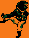
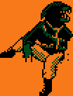
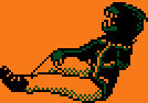
with that third animation then being subdivided into different speeds, becoming slower as time progresses.
Showing the waster gradually approaching death was crucial to the story. The game would, ironically, have felt much less alive if the waster had stayed in that first pose forever.
Subtext through character design
There’s a point early on in the game where the waster says:
God, they were mad. Said they'd de-limb me if I shared this place with any other hungry wasters.
Initially, the waster’s arm appears to be holding onto the thorn. Except, when they turn around…
Oops! Turns out the waster did get de-limbed. If the player manages to notice this, then it adds an extra layer of dramatic irony when the waster starts to question if they’re only alive because of their selfishness.
I think playing with character design this way, making it supplementary or contradictory to what they choose to tell us, can really flesh out your characters and make them feel more like real people. This was entirely accidental (I only got the idea because I didn’t know how to draw the waster’s other arm without it looking awkward) but it’s something that I’m excited to explore more in future characters.
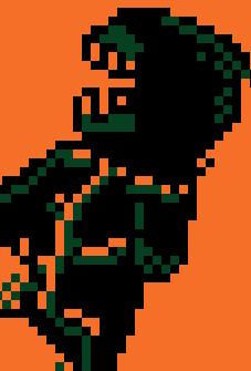
Theft
I wanted to show that the waster had come to die in an environment that was homely to them, but hostile to regular humans. I didn’t know how to draw that environment. So I did what every other artist does when they’re out of ideas: I stole one from another artist.
The background in WASTE EATER is a direct reference to artist depictions of long-term nuclear waste warnings:
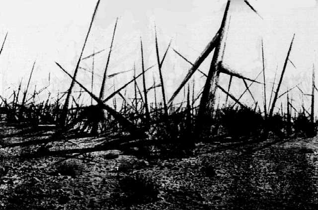
Some very smart people already came up with an idea for how to design a hostile, hazard-signaling landscape, so why not use that? It’s an extra easter egg for anyone who’s seen the “this is not a place of honor” memes too.
So, yeah. Those were some of the art problems that plagued me throughout the development of WASTE EATER, and I think I managed to overcome them pretty alright. The art was a solid 90% of the work and this project forced me to properly start thinking about how I can use visual storytelling in places where text isn't enough. Hope this was interesting to someone else too!
Comments
Log in with itch.io to leave a comment.
Thank you for sharing your process in this devlog it made me appreciate the game and artistry even more and I already thoroughly appreciated the game on its own.
I think the art worked really well! We didn’t notice much of it consciously (just the slowing breaths and the nuclear waste warning message reference) but we could feel the kind of mood you’re talking about.
thank you!! 💕